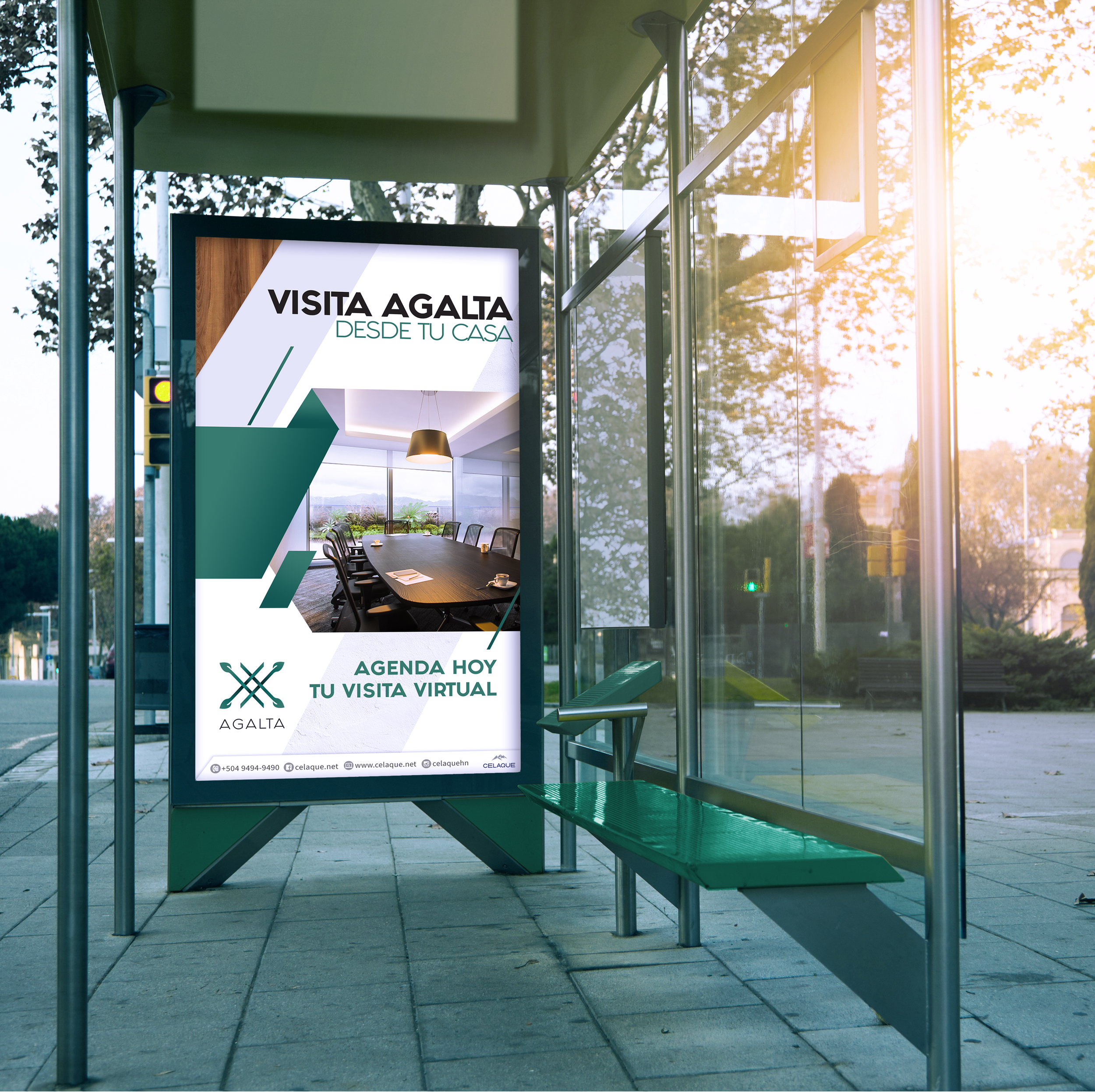
BRAND STRATEGY AND BRAND IDENTITY DESIGN
Agalta is a modern office space building that stands out for its green internal areas and shared coworking spaces that facilitate the connection with other professionals within the building’s area.
THE STORY BEHIND THE BRAND
Agalta was conceived to be a space that merges office spaces and innovative coworking areas with garden areas. The logo was created in order to integrate all these differentiating features into one simple and memorable logo. The graphic icon of the logo is based on the image of a minimalist vine (half of the entire building’s facade is covered with a green vine plant) that conveys the idea of connectivity (coworking spaces), professionalism (offices), and green areas (contemporary and relaxing environments).
The green color highlights the importance of the green spaces within Agalta. In addition, the color green conveys a sense of harmony, abundance and growth. In contrast, the dark gray color of the wordmark complements the overall composition and thus convey elegance and importance.
The typography in the wordmark is san serif and minimalist which complements the style of the graphic icon.


